

 Português pt
 Español es
 العربية ar
 বাংলা bn
 Deutsch de
 Filipino fil
 Français fr
 हिन्दी hi
 Bahasa Indonesia id
 Italiano it
 Русский ru
 Svenska sv
 ไทย th
 Türkçe tr
 Tiếng Việt vi
 简体中文 zh
Chart Types for Technical Analysis: Which One to Choose
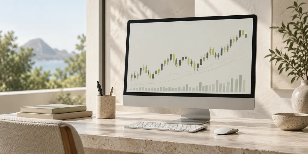
Before learning any indicator, every trader needs to decide something more basic: in what format they're going to look at price. The same asset, over the same period, can look completely different depending on the chart type chosen, and that changes what's easy or hard to see.
There's no single "right" chart type for everyone. There's the one that fits what you're trying to decide: identifying a long-term trend, finding a precise entry point, or filtering out the noise of a choppy market. Here are the most used options and what each one is best for.
Line chart: the starting point
The line chart connects only the closing prices of each period, forming a continuous line. It's the simplest format to read and the most suitable for someone looking at an asset for the first time, because it shows the overall direction with no extra information to interpret.
The limitation is exactly that simplicity: by using only the close, the line chart hides what happened during the period — if the price spiked a lot and gave it all back, for example, that won't show up. That's why it tends to be more useful for a long-term overview than for deciding the exact moment for a trade.
Bar chart: more information, more visual clutter
Each bar shows four values for a period: open, high, low, and close (the set known by the acronym OHLC). A tick on the left of the bar marks the open, a tick on the right marks the close, and the vertical length shows the range between the high and the low.
The bar chart delivers the same information as the candlestick, but in a visually more discreet way. Some traders prefer this format precisely to avoid the psychological bias of the candlestick's strong colors, discussed next.
Candlestick: the most used in day-to-day trading
The candlestick also shows the open, high, low, and close, but in a visual way: a colored body that represents the distance between the open and the close, and shadows (the "wicks") that mark the extremes of the period. When the close is above the open, the body usually shows up in one color (green, for example); when it's below, in another (red).
This visual clarity is why the candlestick is the most popular format among those who practice technical analysis. Patterns formed by one or more candles — such as engulfing, hammer, or shooting star — only exist in this type of chart, because they depend on the shape of the body and the shadows to make sense.
Heikin-Ashi: smoothing the trend
Heikin-Ashi uses its own formula that calculates each candle from an average with the previous candle, which smooths the chart and makes it easier to identify an ongoing trend. In an uptrend, it's common to see several green candles in a row with almost no lower wick; in a downtrend, the opposite.
The trade-off is that, being an average, Heikin-Ashi doesn't show the real open and close price of each period. It's more useful for confirming that a trend is underway than for marking the exact entry or exit point of a trade.
How to decide which one to use
A practical way to choose is to think about the question you're trying to answer:
- "Where is this asset generally heading over the last few months?" — a line chart is usually enough.
- "Is there a reversal pattern forming right now?" — candlestick is the format that carries this information.
- "Is this uptrend still solid or already losing strength?" — Heikin-Ashi helps see this with less noise.
- "I want to see the price data in the most neutral way possible, without colors grabbing my attention?" — the bar chart fills that role.
Many experienced traders end up using more than one chart type during the same analysis: a line or Heikin-Ashi chart to understand the bigger picture, and the candlestick to refine the entry decision. Platforms like Astron let you switch between these formats on the same asset, which makes this kind of comparison easier.
The chart type is a reading tool, not a guarantee of a correct call. Testing each format on a demo account, observing how you best interpret the information, is the safest path before applying any chart reading to trades with real money — and even then, the risk of loss is part of the market.
Practice before you risk. Open your Astron account and test your ideas on the demo account with R$ 10,000 in virtual funds.
Create free account